
Visuals are a brand's fastest layer of communication. They create instant recognition, express positioning without a word of copy, build trust before a customer reads a single claim, and move people toward a purchase. The brain can identify an image in as little as 13 milliseconds, according to research cited by Shopify, and people form judgments about a brand almost that quickly. Color alone can drive substantial recognition gains, per the Visual Identity Guide. Sourcesnova works with manufacturers and growing brands to turn that strategy into usable visual systems rather than one-off design files.
Five outcomes matter most:
- Recognition: instant identification across channels
- Differentiation: standing apart in a crowded category
- Trust: signaling credibility before a customer reads anything
- Emotional connection: triggering a feeling faster than text can
- Conversion: turning attention into a sale
Pro Tip: Lock in your color palette and usage rules before you commission a single decorative asset. Everything downstream, from packaging to social templates, inherits from that decision.
Key Takeaways
Visuals function as a brand's fastest, most direct signal of recognition, trust, and value, and that signal only holds up when it's governed with the same discipline as any other business asset.
| Point | Details |
|---|---|
| Color comes first | Design your palette before your logo since color drives the fastest recognition signal, per the Visual Identity Guide. |
| Strategy before assets | Define positioning and audience before commissioning any visual work to avoid fragmented identities. |
| Consistency pays off | Consistent visual presentation is tied to revenue gains of roughly 23 to 33 percent in industry reporting. |
| Govern quarterly | Run a quarterly brand consistency audit scoring color, typography, logo, and imagery to catch drift early. |
| Get the system built right | Sourcesnova pairs visual strategy with website design and catalogs so brand codes and buyer-facing pages launch together. |
Table of Contents
- What Is the Role of Visuals in Branding vs. Visual Identity?
- Why Do Visuals Matter So Much in Marketing?
- What Are the Core Visual Elements of a Brand?
- How Do You Build a Visual Branding Strategy From Scratch?
- How Do You Keep Visual Branding Consistent Over Time?
- What Can Apple, Coca-Cola, Nike, and Glossier Teach You About Visuals?
- Does Visual Design Actually Increase Brand Value?
- How Should Visual Branding Adapt Across Different Markets?
- How Do Visuals Connect to Tone of Voice and Messaging?
- Should Visual Branding Follow Trends or Stay Timeless?
- What Are the Most Common Visual Branding Mistakes?
- How Can Sourcesnova Help You Build Visual Branding That Works?
- Sources
What Is the Role of Visuals in Branding vs. Visual Identity?
Visual identity is the toolkit: your logo, color palette, typography, imagery style, and iconography. Visual branding is what you do with that toolkit. It's the deployment of those assets across a website, packaging, ads, and social feeds in a way that tells a consistent story.
The distinction sounds academic, but it changes how you plan work:
- Visual identity controls the assets. Logo files, color codes, type specs, and photography guidelines live here.
- Visual branding controls the application. It's how those assets show up in a product launch, a trade show booth, or a checkout page.
- Identity is built once and refined rarely. Branding is applied constantly and needs governance to stay consistent.
Confusing the two is why so many companies end up with a nice logo and a fragmented experience everywhere else. Shopify's visual branding guide frames this as asset creation plus consistent application, not either one alone. Get the terminology straight and you'll know exactly which problem you're solving when something feels off.
Why Do Visuals Matter So Much in Marketing?
Visuals matter because the brain processes them faster than it processes language, and that speed advantage shows up directly in business results. Shopify points to research showing image recognition can happen in roughly 13 milliseconds, which means a logo or color scheme registers before a reader consciously processes anything else on the page.
That speed compounds. Consistent visual presentation across channels can lift revenue by roughly 23 to 33 percent, according to figures compiled in the Visual Identity Guide. Separately, image and video content tends to drive measurably higher engagement than text alone, and product video often improves purchase likelihood, a pattern Forbes and Canva both document from marketer data.
These aren't abstract design wins. They translate into concrete business levers:
- Awareness: a distinct visual signature gets noticed in a crowded feed
- Consideration: consistent imagery builds the familiarity that precedes trust
- Conversion: product photography and video reduce purchase hesitation
- Price perception: polished, coherent visuals support a premium position
The psychology behind this rests on a handful of principles: color psychology (certain hues trigger specific associations), visual hierarchy (size and placement tell the eye where to look first), gestalt grouping (proximity and similarity read as relationships), and emotional resonance, since images convey feelings like trust or ambition faster than words can, an effect Shopify attributes to the near-universal nature of visual language.
What Are the Core Visual Elements of a Brand?
Every brand needs the same basic toolkit, and each piece does a distinct job. Skipping one usually shows up later as inconsistency.
- Color palette. The fastest recognition signal a brand has. Specify HEX, CMYK, and Pantone values plus WCAG contrast ratios so the palette works on screens and in print.
- Logo system. The anchor mark, but it needs variants (horizontal, stacked, icon-only) and documented minimum sizes to avoid misuse.
- Typography. Sets tone before anyone reads a word. Define a type scale with heading, body, and caption sizes, not just a single font choice.
- Imagery and photography style. Signals authenticity. Document lighting, cropping, and subject guidelines so photos from different shoots still feel like one brand.
- Graphic language and illustration. Adds personality beyond photography, useful for brands that can't always access real product shots.
- Layouts and composition. Governs how elements sit together on a page or package.
- Iconography. A supporting visual vocabulary for interfaces and quick-scan content.
- Packaging. Often the only physical touchpoint a customer has, especially for e-commerce brands.
- UI and web elements. Buttons, forms, and navigation patterns that carry brand color and type into a functional product.
- Motion and video. Increasingly expected across product pages and social, and it's where color and typography have to hold up in motion, not just in a static file.
Pro Tip: Sequence the work: color first, then typography, then the logo, then imagery, then icons. Color constrains the most downstream decisions, according to the Visual Identity Guide, so nailing it early saves rework everywhere else.
How Do You Build a Visual Branding Strategy From Scratch?
The right order is strategy first, assets second, guidelines third, rollout last. Skipping straight to logo design without defining positioning and audience is the single most common reason visual systems end up fragmented, a pattern G2's design guidance warns against directly.
- Define positioning and audience. A founder or CMO should own this before any designer opens a file.
- Build a moodboard. Collect references that capture the tone you're after, not the final look.
- Choose your core codes. Lock the palette, primary typeface, and logo direction together, since they need to work as a system.
- Produce the core asset set. Logo variants, a type scale, and a starter photography style.
- Document a brand guideline. This becomes the reference every future vendor, freelancer, or hire works from.
- Roll out and audit. Apply the system across your highest-traffic touchpoints first: website, packaging, or your top social channel.
Small teams don't need a full design department to do this well. A constrained three-color palette, one or two reusable templates, and a documented photo style go further than a large asset library nobody follows. Stock photography edited to match your palette can stand in for original photography early on, and a single short product video often outperforms a dozen static posts.
Before launch, confirm you have: exported files in every needed format, a one-page brand kit, color and type tokens if you have a product team, and a clear approval owner so future assets don't drift without a check.
How Do You Keep Visual Branding Consistent Over Time?
Governance and measurement are what turn visuals from a one-time design project into a repeatable business asset. Without both, even a strong initial identity drifts within a year.
On the governance side:
- Maintain a living brand guideline document, not a static PDF nobody opens.
- Centralize files in one shared library so teams stop recreating assets.
- Require a sign-off step before new visual material goes live.
- Run a quarterly brand consistency audit scoring color accuracy, typography compliance, logo usage, and imagery alignment, a discipline the Visual Identity Guide recommends for exactly this reason.
On the measurement side, four checkpoints matter: awareness (simple recognition surveys asking whether people identify your brand from a color or icon alone), engagement (click-through rate and video watch time), conversion (A/B tests comparing imagery or video variants on a product page), and perception (periodic brand lift surveys). Consistent presentation has been tied to revenue gains in the 23 to 33 percent range in industry reporting from uithings, which makes the audit habit worth the hour it takes each quarter. None of this requires expensive tooling. Standard analytics platforms and a basic A/B testing tool cover most of it, and maintaining consistency across digital channels is as much about discipline as design.
What Can Apple, Coca-Cola, Nike, and Glossier Teach You About Visuals?
Four very different brands, four different visual bets, four lessons worth stealing.
Apple built its identity around restraint: minimal color, generous white space, and consistent typography across hardware, packaging, and retail. The lesson: fewer visual elements, applied with total discipline, read as premium.
Coca-Cola anchored decades of recognition to a single color and script logo, proving that repetition of one distinctive cue outlasts trend cycles. The lesson: pick one visual signature and repeat it relentlessly rather than refreshing it every season.
Nike paired a simple mark with imagery centered on athletes in action, not just product shots. The lesson: show the use-case and the emotion, not only the object for sale.

Glossier grew a community-driven, millennial-pink aesthetic that felt more like a friend's Instagram than a corporate campaign. The lesson: a distinctive, consistent visual tone can build community loyalty even against much larger competitors, a pattern echoed in how independent brands use visual identity to build affinity with niche audiences.
Does Visual Design Actually Increase Brand Value?
Visual design functions as a measurable lever for brand value, not just an aesthetic layer. Academic analysis in the Journal of Business and Economic Research frames visual design as directly tied to brand salience, recognition, and loyalty, using case evidence from companies including Apple, Nike, and Coca-Cola.
Visual design operates as a strategic mechanism in brand value construction: consistent, well-governed design systems correlate with stronger brand salience, higher recognition, and greater customer loyalty across the cases examined.
That framing, drawn from the JBER study, supports a practical recommendation for growing companies: treat design decisions with the same governance rigor as financial ones. That can mean naming a single owner for brand consistency, investing in a repeatable asset system instead of one-off projects, and adding a review checkpoint tied to actual performance, not just aesthetic preference.
How Should Visual Branding Adapt Across Different Markets?
Colors, symbols, and imagery carry different meanings depending on where your audience lives, and a palette that reads as trustworthy in one market can read as generic or even off-putting in another. Red signals luck and celebration in parts of Asia while carrying warning connotations in Western contexts. White reads as purity in many Western markets but signals mourning in parts of East Asia.
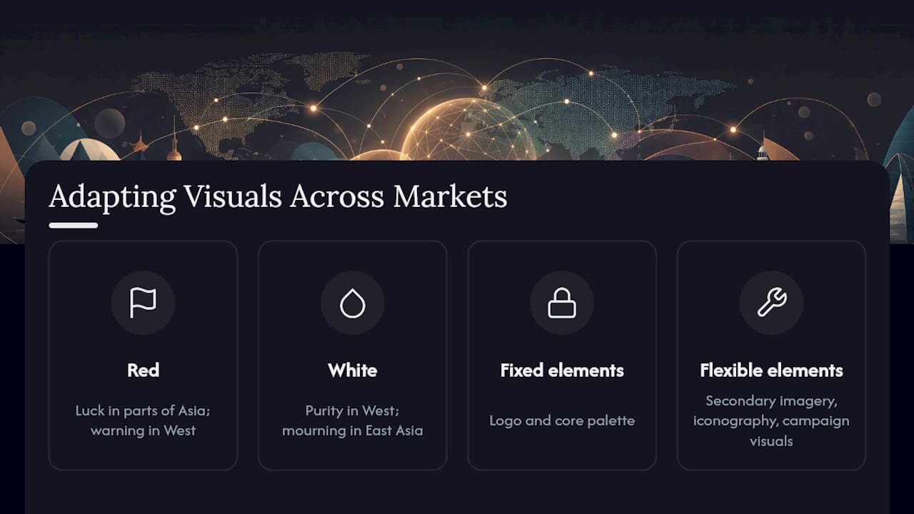
This matters most for brands entering new geographies with existing visual systems already in place. The fix isn't a redesign for every market. It's building flexibility into your guidelines from the start: define which elements are non-negotiable (logo, core palette) and which can flex (secondary imagery, iconography, campaign visuals) for local relevance.
Photography choices need the same scrutiny. Imagery that shows a specific use-case, setting, or model demographic should reflect the market you're actually selling into, not simply be translated from your home market's campaign. For manufacturers and brands entering North America specifically, this often means rethinking product photography and catalog layouts to match what U.S. wholesale buyers expect from a custom website, rather than assuming a domestic-market asset library will translate directly.
Typography carries risk too. A typeface that feels modern in one language can look cramped or illegible when adapted to another alphabet, so type systems built for global rollout need testing in every target language before launch, not after.
How Do Visuals Connect to Tone of Voice and Messaging?
Visuals and messaging have to say the same thing, or the mismatch undermines both. A brand that writes playful, casual copy but presents a rigid, corporate visual system sends a customer two conflicting signals in the same breath, and most people register the contradiction even if they can't name it.
The fix starts with a shared brief. Whoever writes your tone-of-voice guidelines and whoever builds your visual identity should work from the same positioning document, not separate ones drafted months apart. If your messaging emphasizes approachability, your typography and color choices need to reinforce that, not fight it with sharp edges and corporate blue.
This alignment shows up most clearly at the point of sale. A strong digital brand presence depends on copy and imagery reinforcing the same promise on the same page, whether that's a product listing, a landing page, or an ad. Split them, and conversion tends to suffer, because the visual sets an expectation the words then have to fight to match.
Practically, this means auditing your highest-traffic pages together, not separately. Read the copy, then look at the imagery next to it, and ask whether a first-time visitor would describe the brand the same way after reading versus after just glancing at the visuals. If the answers diverge, one of the two needs to change.
Should Visual Branding Follow Trends or Stay Timeless?
Trend-chasing and timelessness solve different problems, and confusing them is expensive. A trend-driven visual refresh can generate a short-term attention spike, but if your core identity, logo, and primary palette shift with every design fad, you erase the recognition equity you spent years building.
The practical answer is layering. Keep your core identity, logo, primary color, and core typography, deliberately stable. Let secondary elements flex: campaign graphics, seasonal color accents, social templates, and illustration style. This gives you room to feel current without resetting recognition every 18 months.
Coca-Cola's script logo has barely changed in decades while its campaign imagery evolves constantly. That split, stable core plus flexible expression, is why the brand can run a holiday campaign or a summer promotion without ever looking unrecognizable. Compare that to companies that redesign their entire identity every few years chasing a current aesthetic; they usually spend the following year rebuilding recognition they didn't need to lose.
Before adopting any trend, ask whether it serves your positioning or just mimics a competitor's recent redesign. A trend adopted because it's popular, rather than because it fits your brand's actual meaning, tends to age badly and cost more to reverse than it did to implement.
What Are the Most Common Visual Branding Mistakes?
Most visual branding failures trace back to a handful of repeatable mistakes, and nearly all of them are avoidable with a bit of upfront discipline.
Skipping strategy for asset production. Jumping straight to a logo design without defining audience and positioning first produces visuals that look fine individually but don't cohere, a failure mode G2's design research calls out directly.
No documented guidelines. Without a written brand kit, every new hire or freelancer makes their own interpretation, and the identity drifts within months.
Inconsistent application across channels. A polished website paired with off-brand social templates or packaging tells customers the brand isn't fully considered.
Chasing trends at the core-identity level. Refreshing your logo or primary palette too often resets the recognition you've built.
Ignoring accessibility. Color combinations that fail WCAG contrast standards exclude visually impaired customers and can create real usability problems, especially in dark-mode interfaces.
No governance owner. If nobody is responsible for reviewing new visual material before it ships, drift is inevitable rather than occasional.
The fix for nearly all of these is the same: document the system once, assign someone to guard it, and revisit it on a schedule rather than reactively.
A Publisher's Take on Treating Visuals as Strategy
Visual identity deserves the same strategic weight as pricing or distribution, not leftover budget after everything else is funded. Sourcesnova's work with manufacturers and growing brands consistently shows that a documented system beats a bigger asset library every time. If budget is tight, spend first on a constrained color palette, a simple photography guideline, and a handful of reusable templates. Everything else can wait.
How Can Sourcesnova Help You Build Visual Branding That Works?
If you're a manufacturer or growing brand trying to build a visual system that actually holds up across a website, product catalog, and marketing channels, that's the specific gap Sourcesnova closes. Sourcesnova builds practical visual strategy alongside the website design, RFQ flows, and product catalogs you need to enter the North American market, so your brand codes and your buyer-facing pages get built together instead of stitched together later.

There's no bloated retainer or vague strategy deck involved. You get a working brand kit, a website built around it, and a rollout plan sized to what your business actually needs right now. If you're weighing whether your current visuals are pulling their weight or holding you back, start with a visual and market entry review from Sourcesnova to see exactly where the gaps are.
Sources
For deeper reading on the claims above: Shopify's visual marketing guide covers image-processing speed and engagement data; the JBER study details the academic case for visual design's link to brand value; the Visual Identity Guide offers technical specs for color, contrast, and governance; Canva's visual marketing guide breaks down image and video engagement patterns; and Forbes rounds out practitioner perspective on visual marketing's commercial impact.
- How To Craft a Visual Marketing Strategy That Converts (2026) - Shopify
- Visual Marketing: The Power Of Images & Videos For Promoting Your Brand - Forbes