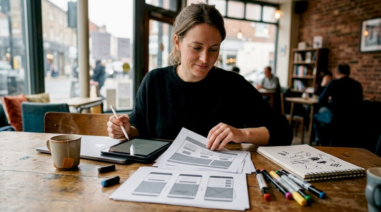
Website design trends 2026 are defined by AI-personalized layouts, mature visual systems like Bento grids and Glassmorphism 2.0, and performance-focused minimalism that directly shapes user engagement and brand identity. The industry has moved past novelty aesthetics. What ships in 2026 are adaptive, user-centric design frameworks built for conversion, accessibility, and speed. Whether you are a web designer, developer, or small business owner, understanding which trends have real adoption data behind them separates effective decisions from expensive experiments.
1. What are the top website design trends in 2026?
The most impactful trends this year combine visual maturity with functional purpose. Each one below has measurable adoption or clear performance evidence behind it.
Bento grid layouts
Bento grids are mainstream in 45% of modern SaaS and portfolio sites. They have evolved from simple card arrangements into nested, dynamic compositional systems with live interactive widgets replacing static tiles. The grid acts as a hierarchy tool, not just a layout. You can see this applied effectively in manufacturing sector sites, such as digital countertop platforms, where complex product information is organized into scannable, interactive cells.

Glassmorphism 2.0
Glassmorphism 2.0 reaches 60% adoption in app UIs and card components. The style uses translucency, blur, and layering to create visual depth on flat screens. It works best in dashboard cards, modal windows, and feature callouts where depth signals hierarchy without adding visual weight.
AI-generated imagery and personalized layouts
AI-generated imagery is used by 35% of marketing and blog websites to replace generic stock photography. Custom AI visuals give brands a distinct look that stock libraries cannot replicate. Personalized AI layouts go further, assembling page elements dynamically based on visitor behavior and intent.
Micro-interactions as attention systems
Micro-interactions have evolved from decorative touches into invisible attention systems that direct user focus and signal state changes. A button that subtly shifts color on hover, a form field that confirms valid input in real time, a loading indicator that communicates progress. These details reduce cognitive load and build trust without demanding attention.
Functional minimalism
Functional minimalism removes everything that slows a user down. Scroll-jacking, autoplay videos, and excessive animation are out. Speed and predictability are in. Designers who remove visual distractions report higher conversion rates because users can focus on the action the page is designed to drive.
Dark mode as a design-first choice
Dark mode is preferred by 81.9% of users at the OS level. That number makes dark mode a baseline expectation, not a bonus feature. Designing for dark mode first forces better contrast decisions and cleaner visual hierarchy across both themes.
Variable typography
Variable fonts let a single typeface file carry a full range of weights, widths, and optical sizes. Brands use variable typography to express personality dynamically, adjusting type behavior based on viewport, scroll position, or user preference. This reduces page load from multiple font files while expanding expressive range.
Spatial and 3D UI elements
Spatial design adds dimensionality to flat screens through subtle depth cues, layered shadows, and 3D-rendered components. The key constraint is performance. Spatial elements that require heavy WebGL rendering hurt Core Web Vitals scores. The best implementations use CSS-based depth effects and pre-rendered 3D assets to maintain visual impact without sacrificing speed.
Pro Tip: Pick two or three of these trends that align with your brand's existing visual language. Applying all eight at once creates visual noise, not sophistication.
2. How does AI integration change website design workflows in 2026?
AI-native layouts replace static mockups by dynamically assembling page cells, copy, and CTAs based on visitor intent and behavior. This is a structural shift, not a cosmetic one. A returning visitor sees a different page composition than a first-time visitor from a paid ad. The page adapts its hierarchy to match what that specific user is most likely to act on.
For small business owners and designers, the practical benefits are significant:
- Efficiency: AI tools generate layout variations and content drafts in minutes, reducing the time from brief to prototype.
- Distinctiveness: AI-generated illustrations and custom imagery replace generic stock photos, giving brands a visual identity that competitors cannot easily copy.
- Better engagement: Personalized CTAs and adaptive content blocks improve click-through rates because the message matches the visitor's context.
- Scalability: A single design system can serve multiple audience segments without building separate pages for each.
The limitation is control. AI-assembled layouts can drift from brand guidelines if left unchecked. The best practice is to define a strict design token system, including color, type, spacing, and component rules, before enabling AI composition. The AI fills the grid; the designer sets the rules.
Pro Tip: Treat AI as a layout assistant, not a creative director. Set your brand tokens and component library first, then let AI work within those constraints.
3. What role do performance and accessibility play in 2026 web design trends?
Performance is no longer a backend concern. It is a design decision. Sites that meet Core Web Vitals standards convert at a rate 24% higher than those that do not. That gap is large enough to make performance a primary design constraint, not an afterthought.
The 2026 design trends that support performance include:
- Functional minimalism: Removing scroll-jacking and autoplay videos reduces page weight and respects user attention. Predictable scroll behavior alone improves time on page.
- Dark mode best practices: Avoid pure black (#000000) backgrounds. Material Design standards recommend elevated dark grays like #121212, which reduce eye strain and improve shadow-based UI depth rendering.
- Accessible color systems: High-contrast color pairings that meet WCAG 2.1 AA standards serve users with visual impairments and improve readability for everyone in bright or low-light conditions.
- Mobile-first layout decisions: Mobile devices account for 58.67% of global website traffic. Designing for mobile first means your layout, type scale, and tap targets are correct by default, not patched after the fact.
- Sustainable design: Reducing unnecessary scripts, heavy image formats, and redundant third-party requests lowers server load and carbon footprint. Sustainable design is both an ethical position and a performance strategy.
Accessibility is also a legal mandate in many markets. Color contrast, keyboard navigation, and semantic HTML are not optional enhancements. They are baseline requirements that also improve SEO and usability for every visitor.
4. How small business owners can apply 2026 design trends for growth
Small business owners do not need to implement every trend. Selecting two or three high-leverage changes produces better results than a full redesign chasing every new style. The website design process for business owners starts with identifying what is currently blocking conversions, then applying trends that solve those specific problems.
The highest-impact choices for small businesses in 2026 are:
- Adaptive Bento layouts for clearer messaging: Replace a cluttered homepage with a Bento grid that separates your core service, social proof, and CTA into distinct, scannable cells. Visitors understand your offer faster.
- AI-generated custom illustrations: Replace stock photos with AI-generated visuals that match your brand's color palette and tone. This costs less than custom photography and produces a more distinctive result.
- Micro-interactions to guide attention: Add hover states to your primary CTA button, confirmation animations to your contact form, and progress indicators to any multi-step process. These small details build credibility.
- Mobile-first layout review: Test your current site on a mid-range Android device on a 4G connection. If the layout breaks or loads slowly, that is where you lose the majority of your traffic.
- Dark mode support: Offer a dark mode toggle or detect OS preference automatically. With 81.9% of users preferring dark mode at the OS level, ignoring it means your site looks wrong for most visitors by default.
Understanding how website design drives growth for small businesses comes down to removing friction and building trust. Every trend above serves one of those two goals directly.
5. What emerging visual styles define 2026 design innovation?
The visual language of 2026 web design pulls in two directions at once. One direction is refined and systematic. The other is deliberately raw and expressive. Both have legitimate use cases.
Glassmorphism 2.0 works because it creates perceived depth without adding actual layers to the DOM. A frosted-glass card over a gradient background communicates hierarchy instantly. The upgrade from the original trend is restraint. Designers now apply it to one or two components per page rather than the entire interface.
Spatial and 3D UI elements use CSS perspective transforms, layered box shadows, and pre-rendered 3D assets to create dimensionality. The best examples feel physical without requiring a WebGL renderer. A product card that lifts slightly on hover communicates interactivity more clearly than a color change alone.
Kinetic and scroll-driven animation ties visual storytelling to the user's scroll position. Text reveals, image parallax, and component transitions triggered by scroll progress replace static sections with a narrative flow. Used correctly, this keeps users engaged longer. Used incorrectly, it becomes the scroll-jacking that functional minimalism explicitly rejects.
Brutalism and anti-design aesthetics are gaining ground in niche markets where authenticity matters more than polish. Raw typography, visible grids, and intentional asymmetry signal that a brand has a point of view. This approach works for creative agencies, independent publications, and brands targeting audiences who distrust corporate aesthetics.
The choice between maximalist expression and functional minimalism is not a style preference. It is a strategic decision based on your audience, your conversion goal, and your brand's position in the market.
Key Takeaways
The most effective 2026 web design approach combines AI-personalized layouts, performance-first minimalism, and two or three targeted visual trends chosen for your specific audience and conversion goal.
| Point | Details |
|---|---|
| Bento grids drive clarity | Use nested Bento layouts to separate your offer, proof, and CTA into scannable, interactive cells. |
| Performance directly lifts conversions | Sites meeting Core Web Vitals standards convert 24% higher than those that do not. |
| Dark mode is now a baseline | With 81.9% OS-level preference, dark mode support is an expectation, not a feature. |
| AI layouts need design guardrails | Set brand tokens and component rules before enabling AI composition to maintain consistency. |
| Mobile-first is non-negotiable | Mobile devices drive 58.67% of global traffic, making mobile-first layout the correct default. |
My honest take on chasing design trends in 2026
I have watched designers and business owners burn time and budget trying to implement every trend that surfaces in a given year. The result is almost always a site that looks busy and converts poorly. The trends that actually move the needle in 2026 are the ones that solve a real user problem, not the ones that look impressive in a design portfolio.
Bento grids work because they force you to prioritize content hierarchy. Functional minimalism works because it respects the user's time. AI personalization works when it delivers a more relevant message to a specific visitor. None of these are about aesthetics first. They are about function, with aesthetics serving the function.
The visual trends I am most cautious about are the ones that require significant performance trade-offs. Spatial 3D UI and heavy scroll-driven animation can look extraordinary in a controlled demo and destroy your Core Web Vitals score in production. Test every visual effect against your actual performance budget before committing to it.
The advice I give consistently is this: read the marketing strategies for small businesses that are working right now, identify the two or three design changes that directly support your growth goal, and execute those well. A site that loads fast, communicates clearly, and guides users to a single action will outperform a visually complex site that tries to do everything.
2026 is the year where design maturity matters more than design novelty. The businesses that win are the ones that treat their website as a conversion system, not a creative showcase.
— Tran
Sourcesnova helps you build a site that actually performs
Web design in 2026 rewards clarity, speed, and relevance. Getting those three things right requires more than following a trend list. It requires a clear strategy, a well-structured site, and design decisions grounded in how your specific audience behaves.
Sourcesnova works with local and small-to-mid-size businesses to build websites that get found, look professional, and turn visitors into customers. From layout strategy and visual identity to performance optimization and ongoing marketing support, the team at Sourcesnova handles execution so you can focus on running your business. No jargon, no bloated retainers. Just clear work that produces real results.
FAQ
What are the top website design trends for 2026?
The leading trends are Bento grid layouts, Glassmorphism 2.0, AI-personalized page composition, functional minimalism, and dark mode as a design-first standard. Each is backed by measurable adoption data across SaaS, marketing, and portfolio sites.
How does dark mode affect web design in 2026?
Dark mode is preferred by 81.9% of users at the OS level, making it a baseline design requirement. Best practice uses dark gray backgrounds like #121212 rather than pure black to reduce eye strain and improve UI depth.
Why do Core Web Vitals matter for design decisions?
Sites that meet Core Web Vitals standards convert at a rate 24% higher than those that do not. Performance benchmarks directly influence layout choices, animation use, and image optimization decisions in 2026 design.
Should small businesses follow all 2026 web design trends?
No. Small businesses get better results by selecting two or three trends that address a specific conversion problem. Applying every trend at once creates visual noise and dilutes the user's path to action.
What is Glassmorphism 2.0?
Glassmorphism 2.0 is a UI style using translucency, blur effects, and layered backgrounds to create visual depth. It reaches 60% adoption in app UIs and card components, and works best when applied to one or two components per page rather than the full interface.